

 Make sure your sign can be seen from the right distance
As a sign professional I’ve made signs that are as big as the side of a building and I’ve made the little decal that goes on the inside of the electrical panel of a fuse box. Signs can be all different sizes so what is the right size of sign for your business? When I’m asked, “How big should my sign be?” I always respond with another question, “Who do you want to read your sign?” In other words, how far away do people have to read this sign? If you are a business that is at a truck stop along the highway you might want people to recognize your sign from a quarter of a mile away, verses a sign in a office building and people will be stepping off the elevator 20′ away. If you are that truck stop and you want to nerd it up you can check out this study about highway signs from the USSC (United States Sign Council) and see what they have to say about your highway sign. I’m now going to focus on signs that you might find when you are not on the highway.
Letter size
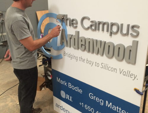
Letter size is one factor to consider if your sign will be visible or not. When considering letter height you should first determine how far away you want some one to see your sign. A rule of thumb is for every inch height of your sign letter you have 10′ of readability. So for a 10″ letter in optimal conditions you should be able to read the 10″ letter from 100′ away. Of course the higher the sign is up on your building the bigger the letter would have to be to be readable. If you are designing a sign to go in a reception area of your office you might not need people to see your sign from 100′ away, but you might need someone to read the sign from 20′ away. So you might look at letters that are 2″ to 3″ tall to be readable.
Letter Color
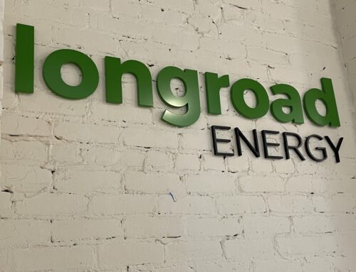
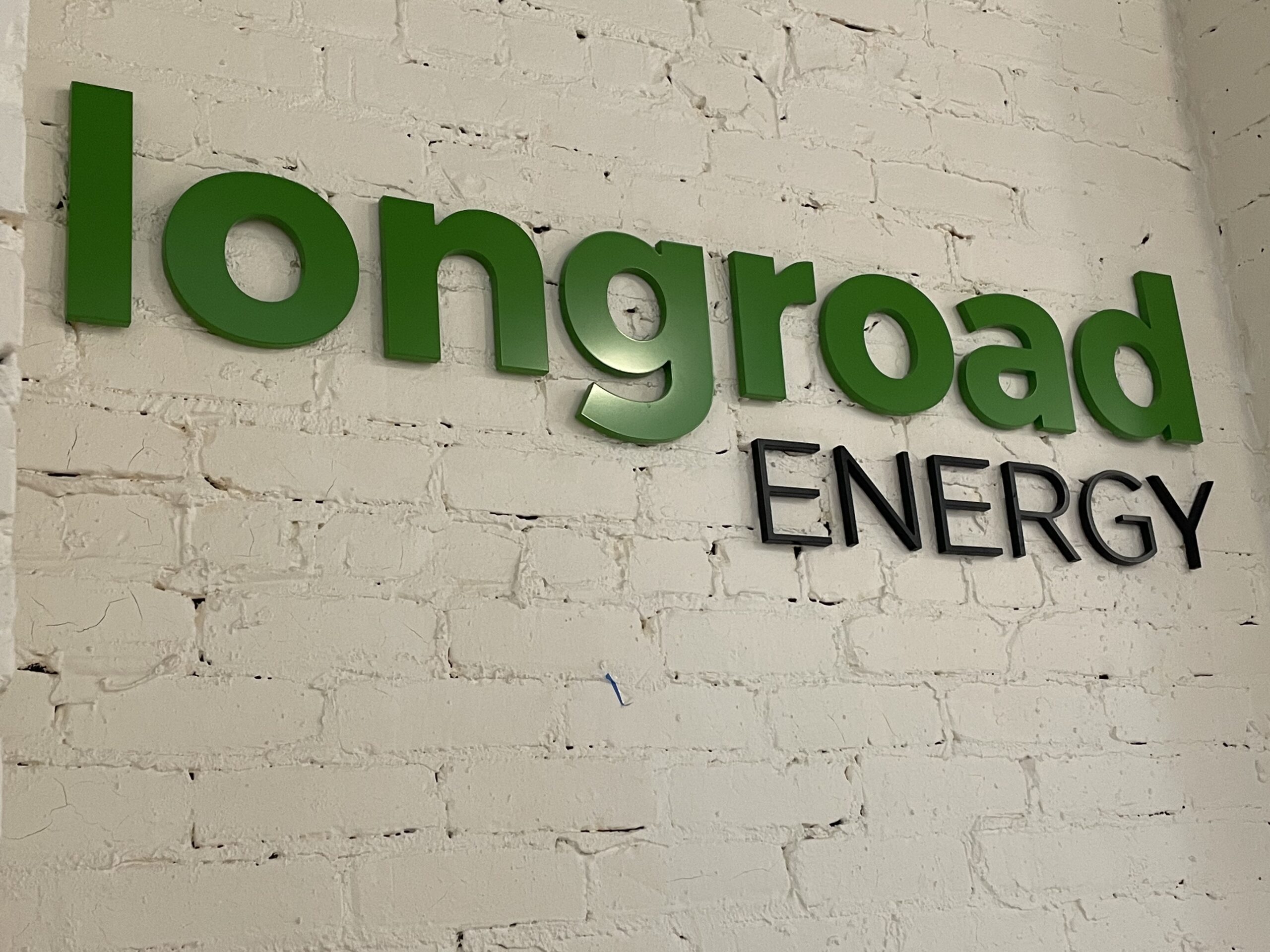
The color of the letters can play a big role in making sure your sign is readable. You want to have contrasting colors with the background colors. So on a white wall the maximum contrast you can have are black letters. Less contrast on a white wall would be yellow letters, but yellow letters would work just find on a painted black wall. A good way to pick the right colors for your sign is to take some paint chips from your local paint store and tape them to your wall then stand back at a good distance. See which colors seem to stand out from the rest. The right colors can make a big impact on the readability of your sign.
Font Style
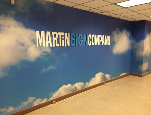
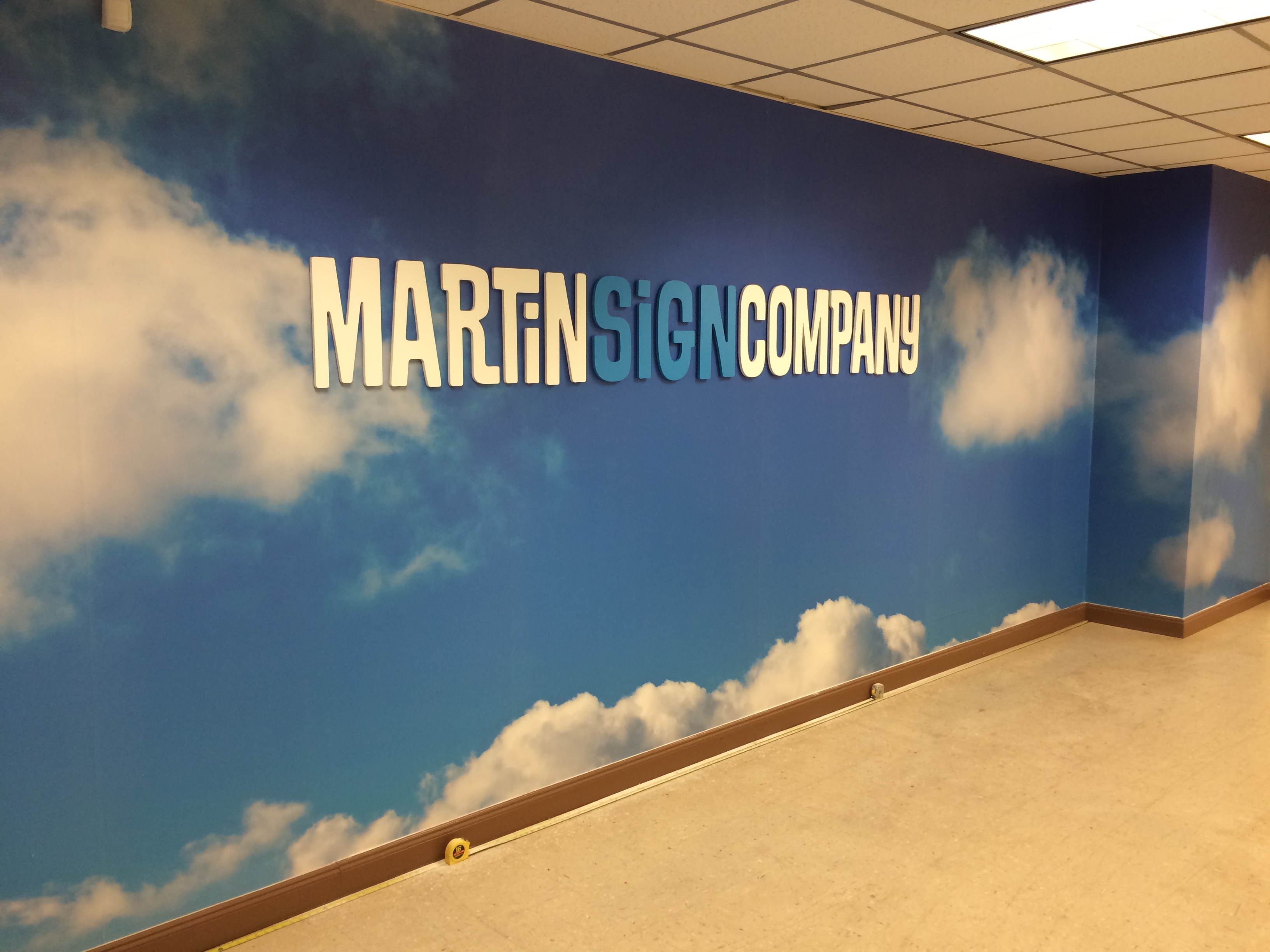
Font styles can also make a huge impact on a readers ability to read your sign. A fat font will be hard to read from really far away, but a really thin font will also disappear. Script fonts can be unreadable from near or far so beware of using too much script fonts, especially on really thick letters like channel letters. A good way to test different fonts is to print out on a couple pieces of paper the name of your company in different fonts at a large size then tape the paper up on a wall and step back to see which ones are the most readable.
Although size, color, and style are all subjective you might still be stumped when it comes to making the investment in your sign. The bigger your sign is the more it might cost and so you really only want to do it once. This is why you should include a sign professional on your design team. A sign professional has seen all these things before and can visit the job site to give you options for you sign. Including a sign professional will save you time and money by bringing samples of material, advising on contrasting colors, letter height and use of fonts or logo.