

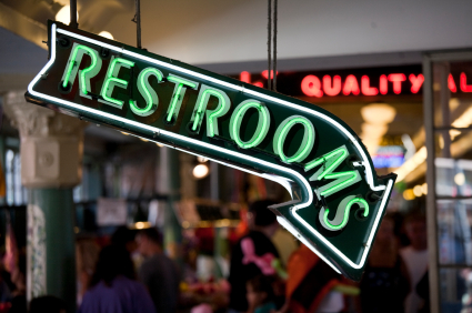
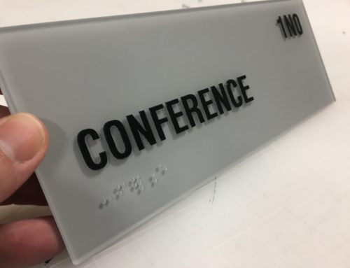
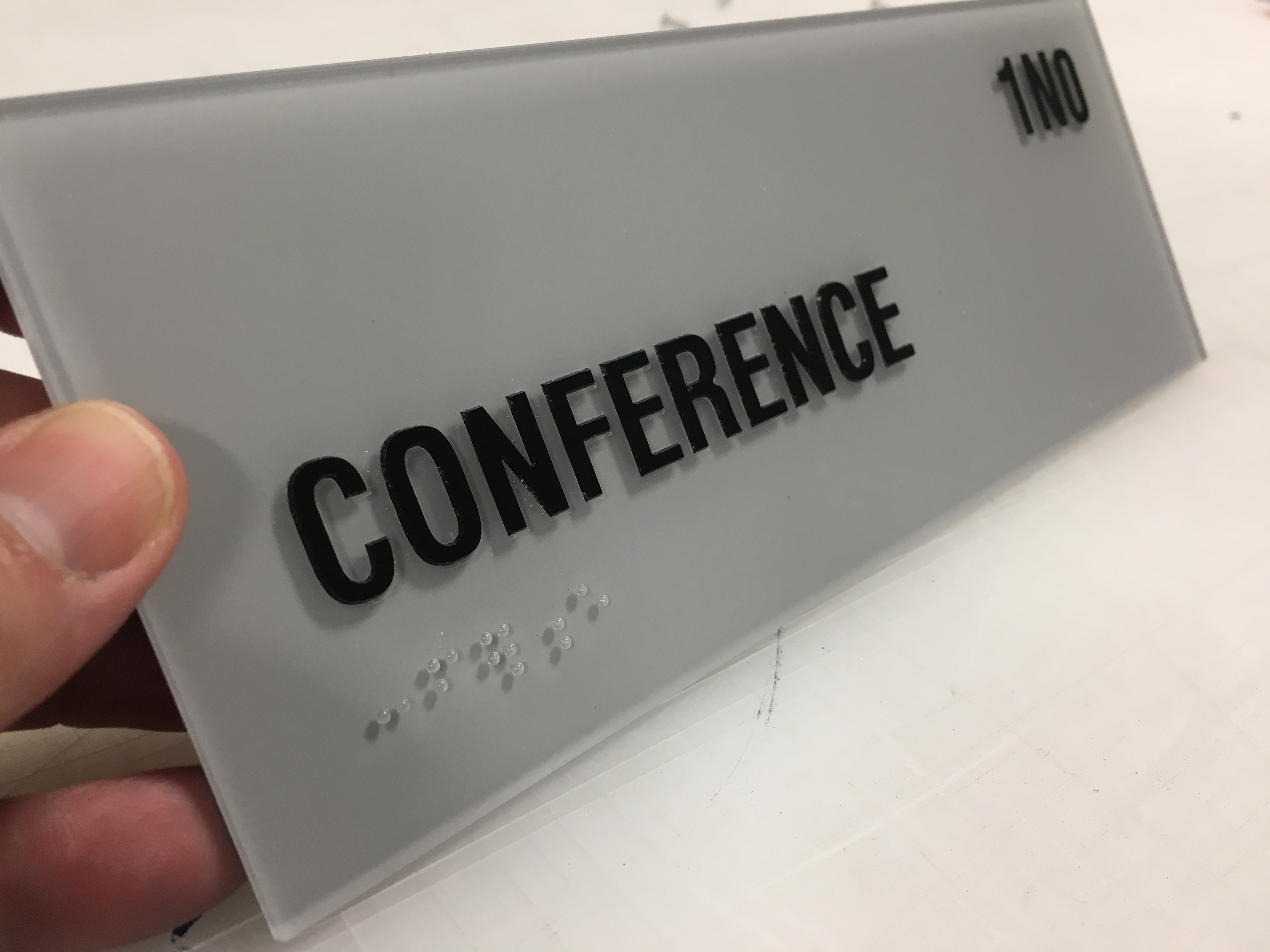
There are many pieces to the puzzle when it comes to ADA signs. The Americans with Disabilities Act, or ADA, set the standard for the civil rights of disabled persons in America. It is a wide-ranging law that not only prohibits discrimination based on an individual’s disability, but provides guidelines on accessibility in a public space. A huge part of the ADA Accessibility Guidelines (ADAAG) involves informational signage to help a disabled person get around. Although the most visible ADA signs of this type involve raised characters and Braille, any architectural sign that provides information about the accessibility features of a facility must comply. Any permanent room or space in a public facility needs to be labeled with a tactile and Braille sign. These signs are placed at the strike side of a door at 60” to center, and inform disabled and non-disabled persons about the intended use of the room. These types of signs should be seen at every door in a public space, and have a couple key features in their design. First of all, the signs all have raised text and Braille to aid visibly impaired individuals. In California, per C.B.C. Section 1117B.5.6, we have to use CA Contracted Grade 2 Braille, which has more stringent requirements in regards to size and spacing than the traditional ADA requirements (http://www.dgs.ca.gov/dsa/Programs/progAccess/braille.aspx). The word “Contracted” refers to the shorthand form of Braille utilized as Grade 2, which uses one or more cells to reference groups of letters or whole words. Also, the Braille dots themselves are to be “domed” and raised 1/40” off of the face of the sign, and the spacing between cells is to be .20”. All of these minute details are for the 10% of visibly impaired individuals who can actually read Braille (http://brailleinstitute.org/About_Sight_Loss/Common_Misconceptions.aspx). For the remaining 90% of visibly impaired persons (those who are legally or partially blind), the signs are required to have raised text that can be “read” by the fingers. This text is to be between 5/8” – 2” tall, raised 1/32” off of the surface of the sign, and be noted in all caps. Also, the font type is to be non-decorative, and consist of san-serif or “simple” serif fonts. These are font types that are the easiest to read visibly and with the hands. The last key feature of this sign type is the coloration. The ADA Accessibility Guidelines require a 70% contrast between the text and background of the sign, as well as a 70% contrast between the background of the sign and the surface in which it is mounted. Because not all of us have access to a spectrometer to measure the light contrast between the background and text, a good rule of thumb is to place either dark characters on a light background, or light characters on a dark background. The finish on the signs are also to be “matte” or “eggshell” in appearance, as reflection or glare on the surface makes them difficult to read (http://www.access-board.gov/adaag/html/adaag.htm#4.30). Although these sound like extremely tight limitations, there is a lot of room for designers to get creative and still meet the ADA requirements. Because these signs are required at basically all doors and passageways, they become elements of the architecture and can be “branded” to fit the building or tenant. Because restrooms are some of the most important permanent spaces in a public facility, a permanent room sign must be installed on the wall to the strike side of each restroom door. Whether the sign states “Men”, “Women”, or “Unisex”, they must include a pictogram of the corresponding symbol of accessibility, of which the border dimension must be 6” minimum in height. Some examples of simple, off-the-shelf restroom wall signs can be found on our online store at www.shopmartinsignco.com under “Office/Facility Signs”. In many states in the U.S., this one permanent room sign is enough to mark a restroom. California on the other hand marches to the beat of it’s own drum in regards to accessibility regulations. In Title 24 of the California Code of Regulations (http://publicecodes.citation.com/st/ca/st/index.htm), an additional sign is required to label the doors of the restrooms along with the permanent wall sign. This additional sign is to be mounted on the door at 60” to centerline, and be in the shape of a 12” diameter circle for “Women”, 12” equilateral triangle for “Men”, or a 12” diameter circle with a 10” equilateral triangle superimposed on top for “Unisex”. The signs are to be ¼” thick for “Women” or “Men”, and ½” thick for “Unisex”, and have a matte or non-glare finish like the permanent room signs. They are also required to follow the same color specifications, but must have flush symbols and text (if any at all) and no Braille. The reasoning behind the flush graphics and lack of Braille is that you don’t want a visibly impaired person to try to read a sign 3” from a door that could swing open and hit them in the head. Some examples of simple, off-the-shelf restroom door signs can also be found on our online store at www.shopmartinsignco.com under “Office/Facility Signs”. In addition to tactile and Braille signs marking permanent spaces in a facility, they are also needed to identify the exit path in case of an emergency. This includes everything from the traditional “EXIT” sign that you see next to exterior doors, to “EXIT ROUTE” signs in corridors, “STAIRS” signs outside of stairwells, and “IN CASE OF FIRE, USE STAIRS” signs outside of elevators. Once again, these signs are not just helpful for visibly impaired individuals, and they can be lifesavers in an emergency. Another key component of keeping your facility up-to-date in regards to signage are ISA and directional signs for wheelchair users. ISA is an acronym for “International Symbol of Accessibility” and it is a requirement for every handicapped accessible door to be labeled with a 6” ISA sign. This sign is normally mounted on or next to the entrance door, and can be fabricated as a vinyl decal or rigid acrylic plaque. It is also typically ADA blue and white in color, but can be made to match the rest of a building’s sign program if requested. Directional signs are sometimes needed if the path of travel for a wheelchair-bound individual around a public space is not completely clear. These signs must be highly visible, and consist of an ISA Symbol along with directional information (arrows, written directions, etc.). They can be mounted to walls, doors, or freestanding poles, and are sometimes reflective or backlit. If money is no option and durability is key, they can even be fabricated as cast plaques, which is how the federal buildings around San Francisco are marked. Although these signs cost more than decals, they are nothing compared to the amount of money that could be spent on lawsuits if the facility isn’t up to code. Even though I have discussed quite a few of the most requested ADA sign types out there, each facility is different and requires a unique ADA signage plan. Wheelchair lifts, assisted listening devices, teleprinters, areas of refuge, and all sorts of other facets of a public space will need to have signs. This is not only to protect the owner of the facility from our increasingly litigious populous, but also to provide the same rights of accessibly to disabled persons that non-disabled people enjoy. If you are ever in need of a free consultation in regards to your ADA sign program, please give us a call at (415) 335-9044 or write an email to sales@martinsignco.com.Tips to keep your business in compliance with proper ADA Signs.
Permanent Room Signage
Restroom Signage
Exit and Stair Signs
ISA and Directional Signs
The Fire Marshal has the last word…
Solving the ADA Signs Puzzle
[uds-billboard name=”ADA Signs” ]


